How we aggregate global data affects how we talk about it, and — more importantly — what we do about it. Global averages mask important disparities in scale while categories like ‘developing countries’ often paper over crucial differences, especially in matters of development and climate change.
So we separated out the 37 OECD members, then all of Africa, and finally the 48 sub-Saharan African countries apart from South Africa to compare their relative share of the global population, the population living in extreme poverty, and the carbon emissions responsible for climate change.
Channeling our favorite dataviz site, we now have this:
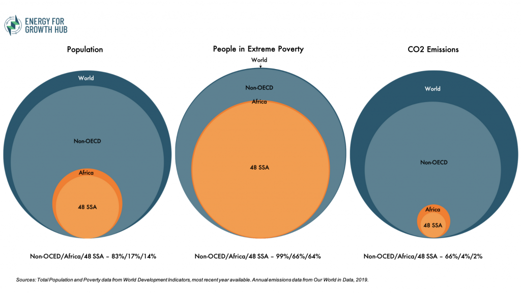
The 48 SSA are home to 14% of the world’s population and 64% of the global extreme poor, but contributed only 2% of the CO2 emitted in the most recent year.
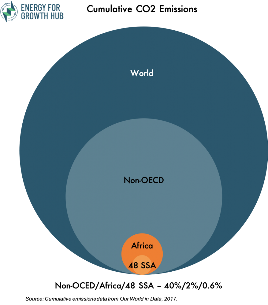
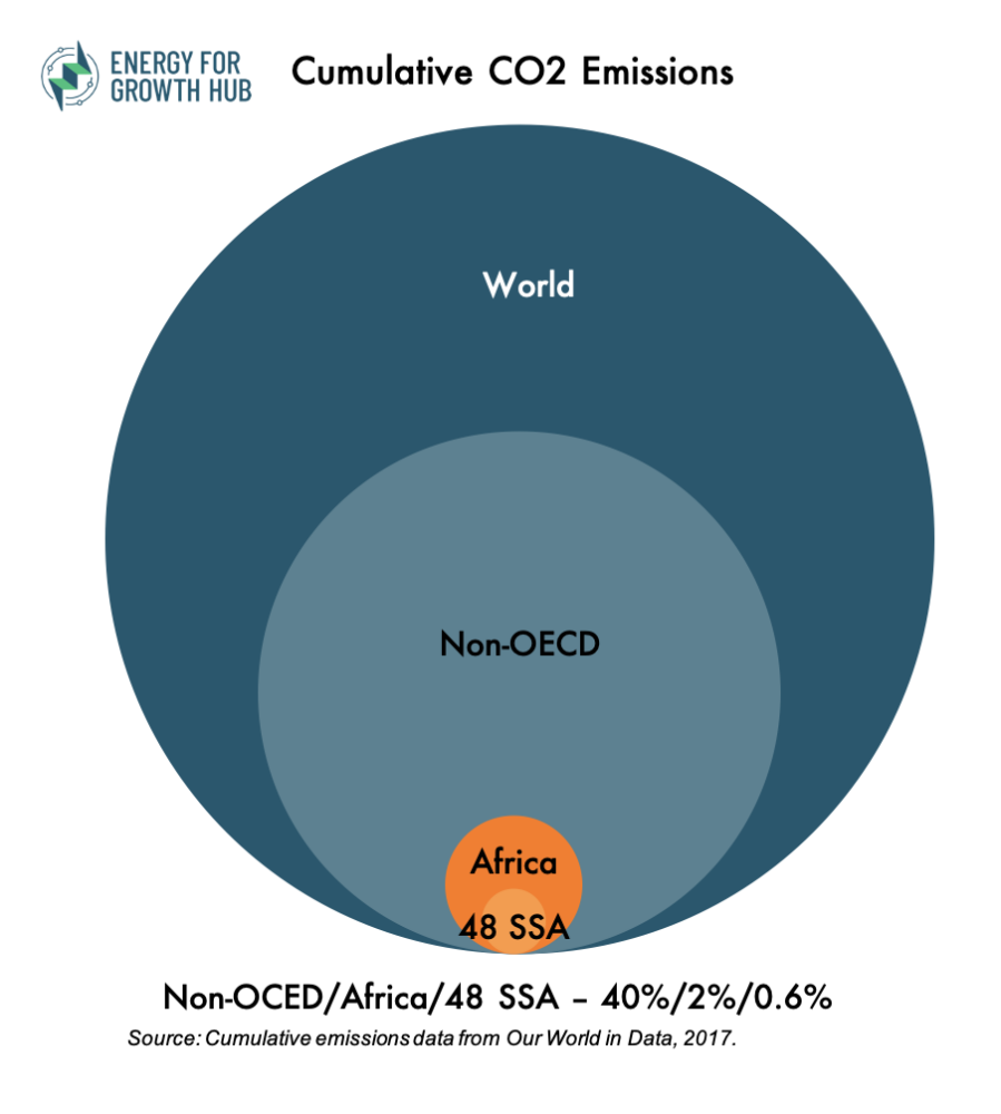
And if we broaden the timespan to consider responsibility of cumulative emissions in the atmosphere?
The 48 SSA have generated just 0.55%: