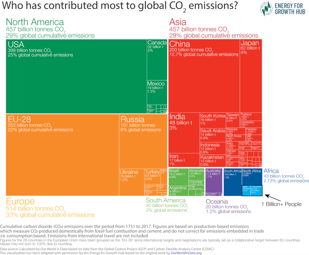
One of the most striking infographics from the wonderful Our World in Data is the treemap which asks “Who has contributed most to global CO2 emissions?” In the original version from Hannah Ritchie, sub-Saharan Africa is so small that only South Africa and Nigeria even warrant labels.
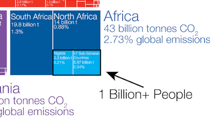
So, with Hannah’s generous permission, we used her data to recreate a reconfigured graphic. Here’s the takeaway from the tiny light blue boxes in the bottom corner: 48 countries, home to more than one billion people, are responsible for 0.55% of cumulative emissions.

If that little box is still too small to see, here’s a zoom.