

Who are the main contributors to climate change?
There are many ways to analyze the data to answer this question. Different metrics tell us different — and important — parts of the story.
You can look at historical contributions — tallying up the emissions over decades and centuries. This stock of cumulative emissions tells us how much warming each country has caused to date. That matters for issues of climate justice, and how responsibilities are shared to reduce emissions going forward.
Alternatively, you can look at each country’s share of the total today. Or adjust this for population to see which individuals have the biggest footprint. These metrics help us understand where mitigation efforts and future investments could have the largest impact. They tell us how to reduce emissions effectively going forward.
For some regions or countries, the metric we choose matters. Take India as an example: it is the world’s most populous country, so its annual emissions look big even though it emits very little per person. And when we look at historical contributions, its share is less than half of what it is using current emissions.
But for countries across Sub-Saharan Africa, the chosen metric doesn’t matter. Regardless of how we slice the data, the region has, and continues to, contribute just a tiny fraction to the problem.
Let’s take a look at the data.
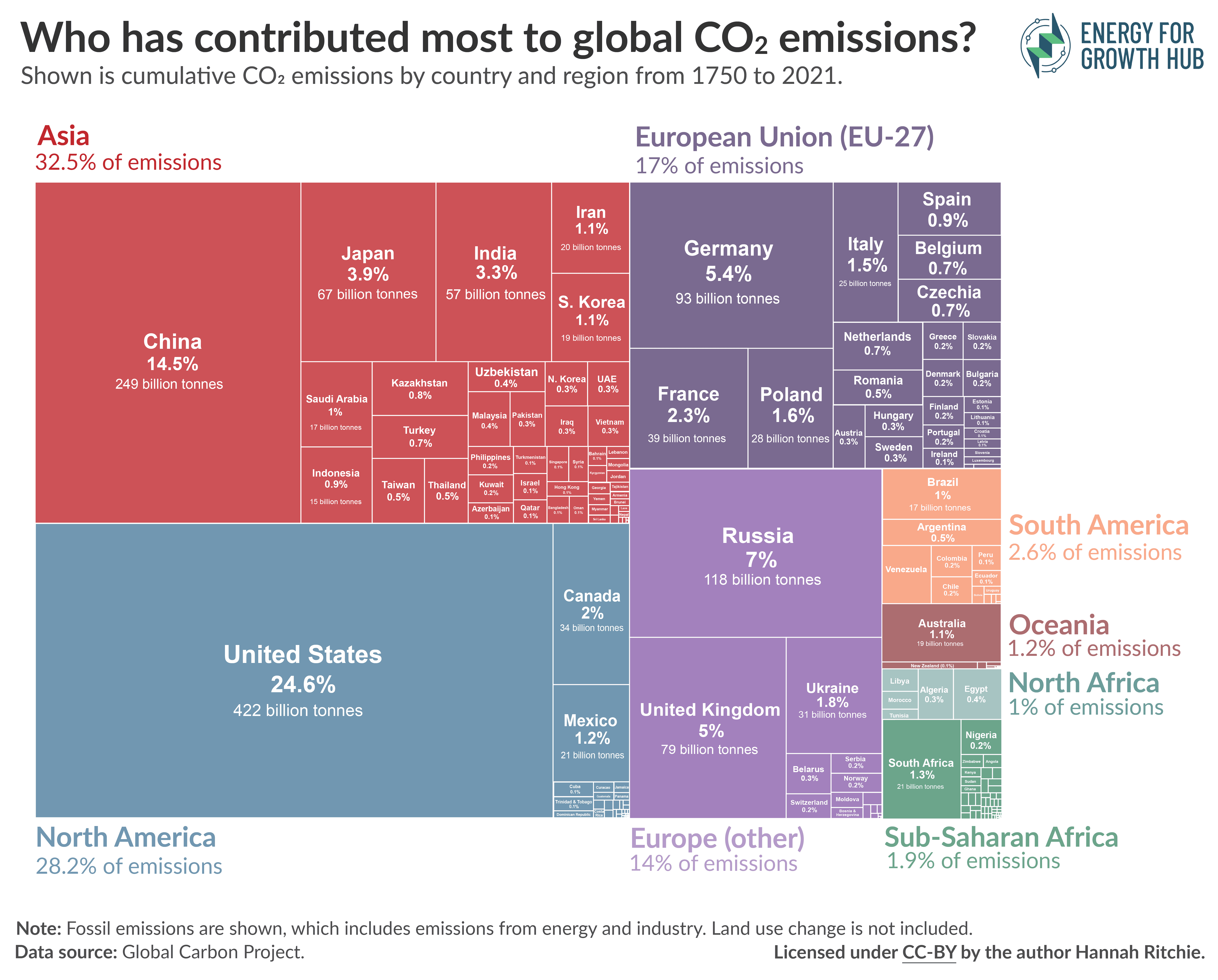
In the treemap below I’ve shown each country’s share of the world’s cumulative CO2 emissions. That’s their historical contribution to climate change. It covers the period from 1750 to 2021, and is based on fossil emissions, which are all emissions related to energy production and industry. Land use change isn’t included. Countries are then grouped by region.
You’ll find Sub-Saharan Africa tucked in the bottom right-hand corner. It has contributed just 1.9% of the world’s emissions. Most of that has come from just one country — South Africa (1.3%). The other 48 countries have contributed just 0.6%.
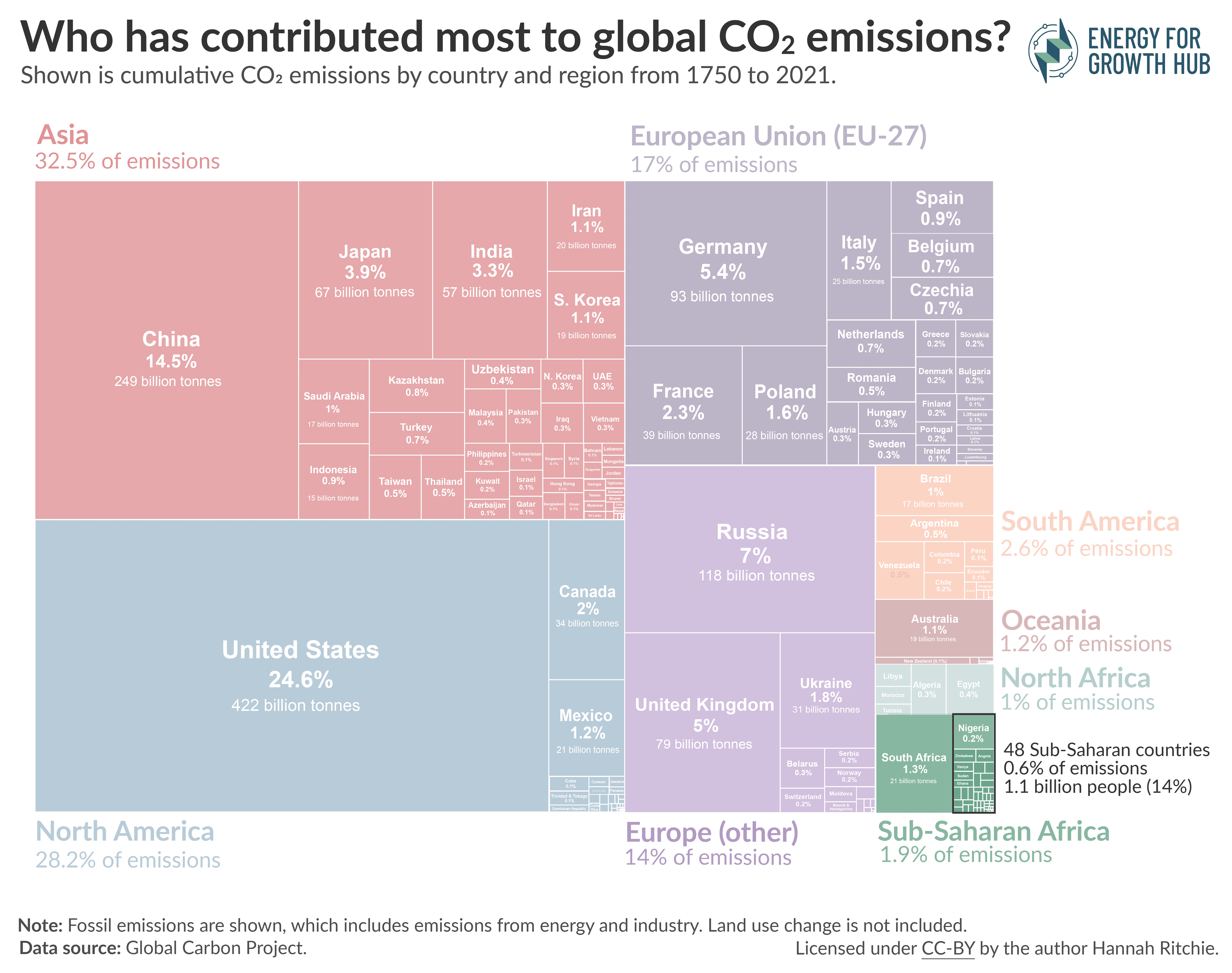
You might be able to see this better if we highlight this small block of countries. Below you’ll find the 48 countries in bold. They are home to 1.1 billion people, which is 14% of the global population. Yet they’ve contributed just 0.6% of emissions. That’s less than Belgium.
The data is clear: Sub-Saharan has contributed almost nothing to the problem of climate change, yet it is one of the most vulnerable regions to its impacts.
Some might argue that while Sub-Saharan Africa has not contributed a lot historically, rapid population growth means that this is changing quickly. Perhaps it is responsible for a large chunk of the world’s emissions today.
Again, this is not true.
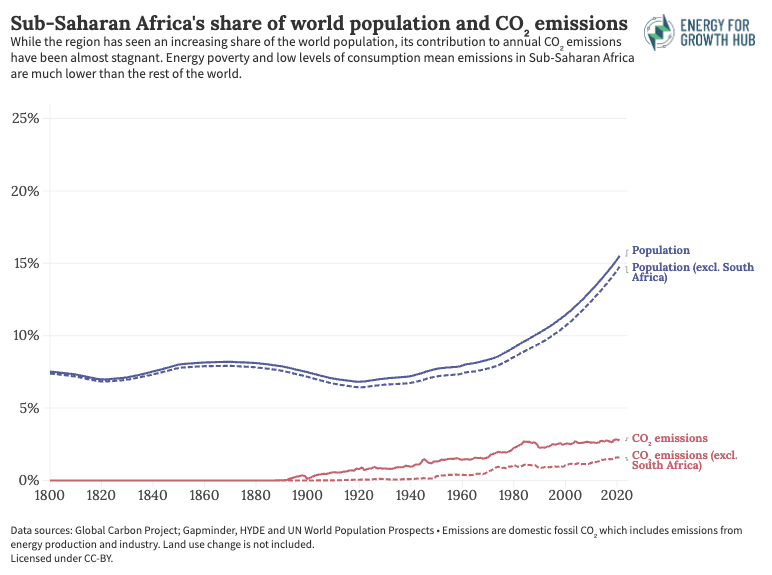
Below, I’ve charted the region’s share of the world’s population and annual CO2 emissions, from from 1850 onwards.
Through most of the 1800s, it was home to around 7.5% of the global population. This has more than doubled since then, to 16%.
But look at its share of annual CO2 emissions. Today, it emits just 2.8%, and that share has been essentially stagnant for decades. Its population has increased much faster than its emissions.
Again, South Africa plays a big role here. With South Africa excluded, the region makes up 15% of the world population, and emits just 1.6% of global emissions.
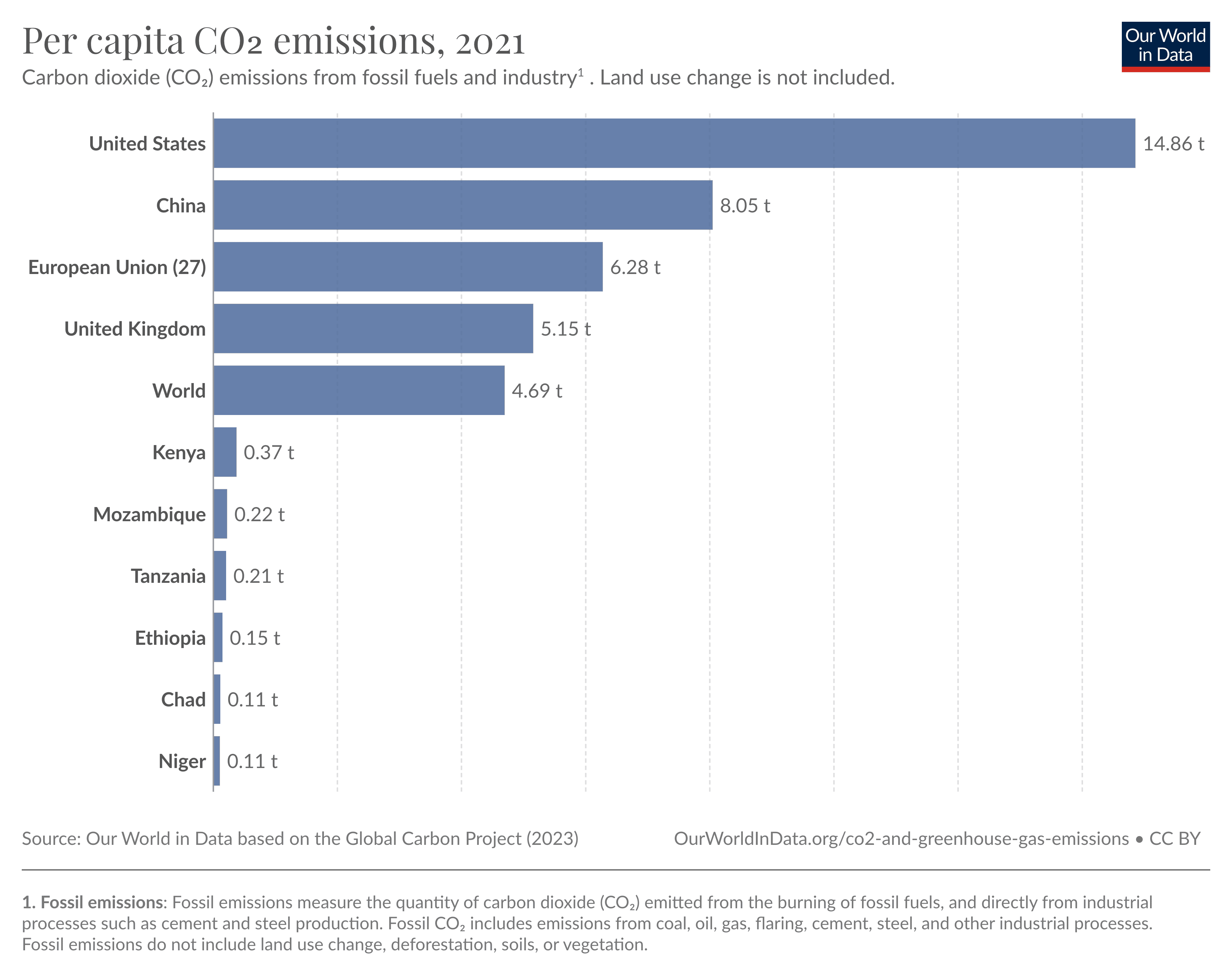
The reason is that per capita emissions are incredibly low. In the chart below, we see some Sub-Saharan countries compared to a range of other emitters. The average person in Chad and Niger emits as much in one year as an American does in 2 to 3 days.
Unfortunately, that’s not because the region has abundant, low-carbon energy. It is an obvious symptom of energy poverty. More than 90% of people in Chad, and 80% in Niger do not have access to electricity. Averaged across the population, annual per capita consumption is just 18 kWh. That’s around half a day’s consumption for the average American.
What’s clear from the data is that Sub-Saharan Africa has contributed next-to-nothing to the problem of climate change — even as its population has grown. This is true regardless of how you slice it. And the driving factor that keeps per capita emissions so low — extremely high levels of energy poverty — makes it even more vulnerable to climate impacts.
Endnotes
- I’ve calculated cumulative emissions based on annual emissions data published by the Global Carbon Project.
Global Carbon Project (2022) Carbon budget and trends 2022. [www.globalcarbonproject.org/carbonbudget]. Published on 11 November 2022. You can explore this data by country on Our World in Data here. - Again, CO2 emissions data is sourced from the Global Carbon Project.
Global Carbon Project (2022) Carbon budget and trends 2022. [www.globalcarbonproject.org/carbonbudget]. Published on 11 November 2022. You can explore this data by country on Our World in Data here.
Population data is sourced from Gapminder and HYDE prior to 1950; and the UN World Population Prospects thereafter.
You can explore this population series for every country on Our World in Data here. - World Bank, World Development Indicators. https://datacatalog.worldbank.org/search/dataset/0037712/World-Development-Indicators
- Of course, this doesn’t mean that everyone with electricity access consumes just 18 kWh. Those with access will consume much more. But since most of the population does not have access, the average across the population is much lower.